
RESUME

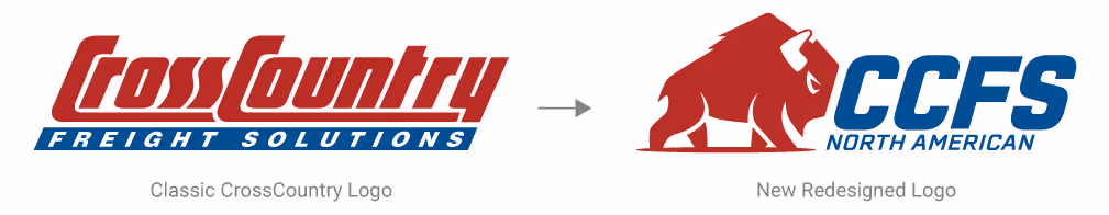
When North American Holdings, the parent company of CrossCountry, began acquiring three additional companies and forming a new logistics division, I was tasked with creating a unified brand identity. The challenge was not only to refresh CCFS’s logo but also to build a scalable brand system that would work seamlessly across the parent company’s expanding network of businesses.
With multiple stakeholders involved, the design process spanned several months and required careful balancing of perspectives. While “design by committee” can often dilute ideas, in this case it fostered meaningful collaboration. Each round of critique challenged the work to evolve, ultimately sharpening the concept and leading to a solution stronger than any one perspective alone.
The final brand system delivered a modern, versatile identity that respects the company’s roots while positioning it for future growth. The new symbol and shortened name brought clarity and memorability, while the patriotic elements helped unify the divisions under a shared vision. The system was designed to scale across the new logistics division and future acquisitions, ensuring long-term cohesion.
This project underscored the value of structured collaboration. By leaning into stakeholder feedback rather than resisting it, the final design became a true reflection of collective ownership while still carrying a clear design voice.
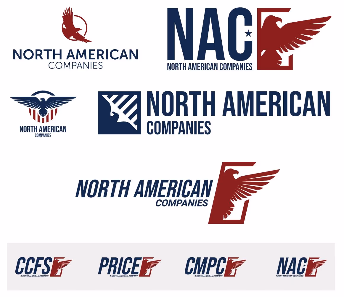
The first round of exploration centered around North American Companies (NAC), a proposed umbrella brand that would house the newly acquired operating companies. The goal was to establish a unifying identity that could scale across multiple divisions, while still leaving room for each company’s individuality.
Although the NAC brand was ultimately set aside, these initial explorations were critical. They allowed stakeholders to see how a cohesive parent brand could function, and they sparked key conversations about hierarchy, scalability, and long-term brand architecture. This early work laid the foundation for the eventual CCFS identity by surfacing what mattered most: clarity, unity, and flexibility across a growing network.
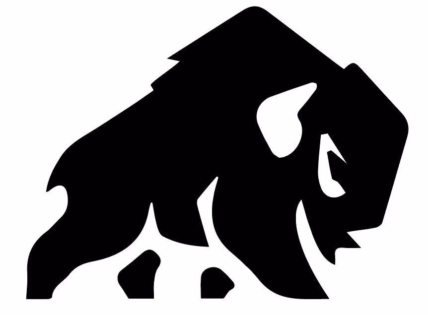
The eagle concept just wasn’t cutting it. (I joked to myself that maybe the bird just wasn’t the word.) Around this time, our CEO found a bison logo available for purchase (with full rights included) and suggested we use it.
At first, I struggled with the idea. As a designer, I didn’t love the thought of adopting a logo I hadn’t created from scratch. But I quickly realized this was a chance to put pride aside and focus on what was best for the company.
The bison turned out to be a perfect fit. It’s a symbol of strength and resilience, carries a patriotic feel, and ties directly to CrossCountry’s North Dakota roots. Still, the logo we purchased needed serious refinement before it could work as the cornerstone of a brand system.
What started as the “ugly bison” became the foundation for a strong, modern identity.
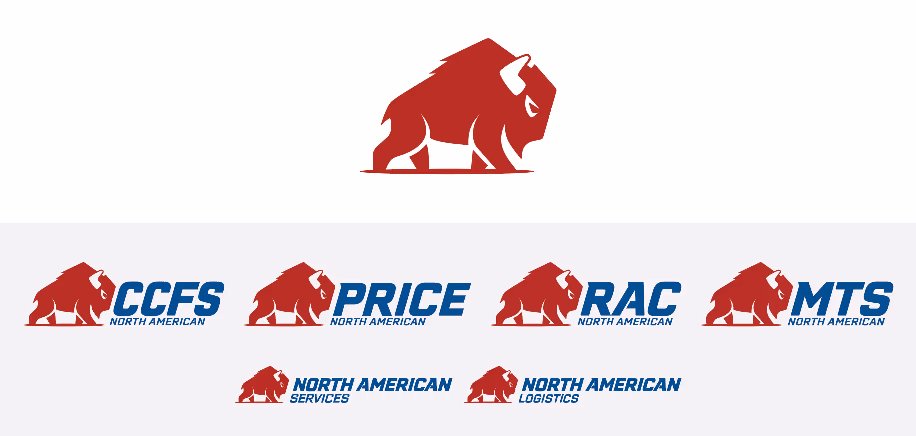
Through rounds of refinement, our once “ugly bison” evolved into a bold, balanced mark. The redesigned symbol captured the strength, resilience, and patriotism we wanted to convey, while also being versatile enough to scale across divisions, applications, and mediums.
The team affectionately named the final design “Tank”, a nod to both its power and durability. Tank became more than just a logo—it became an icon the company could rally around, representing both our heritage and our growth.
 Check Out the Brand Standards